FSI
Brand Identity
FSI (Food System Innovations) is a nonprofit that builds, funds, and invests in market-based solutions to accelerate the transition to sustainable proteins. I led a comprehensive rebrand to modernize FSI's visual identity and strengthen its position as a trusted source of research, philanthropy, and data for the alternative protein industry.

A credible, confident identity for a platform driving system-level change.
FSI operates as a philanthropic impact platform, combining grantmaking, research, programs, and investment to accelerate the sustainable protein transition. In 2025 alone, it directed $25 million to more than 200 grantees across 35 countries. As its portfolio grew to include initiatives like the Food Intelligence Lab and NECTAR, the world's largest public sensory dataset of alternative proteins, FSI needed a brand that could speak with equal authority to large philanthropies, industry collaborators, and research partners.
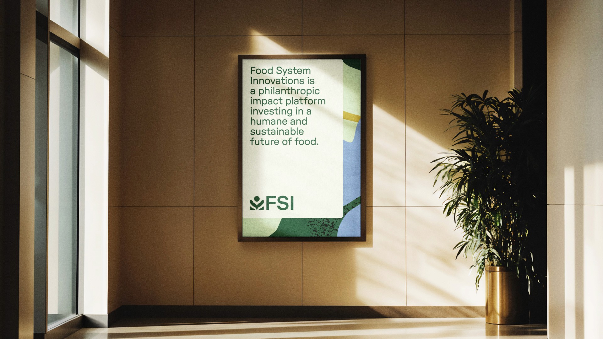
I designed the new branding to reflect FSI's strategic approach to fostering impact, credibility within the alternative protein industry, and innovative research programs. The identity balances confidence with approachability, feeling distinctly modern and future-focused while staying grounded, unbiased, and inclusive.
A credible, confident identity for a platform driving system-level change.
FSI operates as a philanthropic impact platform, combining grantmaking, research, programs, and investment to accelerate the sustainable protein transition. In 2025 alone, it directed $25 million to more than 200 grantees across 35 countries. As its portfolio grew to include initiatives like the Food Intelligence Lab and NECTAR, the world's largest public sensory dataset of alternative proteins, FSI needed a brand that could speak with equal authority to large philanthropies, industry collaborators, and research partners.
I designed the new branding to reflect FSI's strategic approach to fostering impact, credibility within the alternative protein industry, and innovative research programs. The identity balances confidence with approachability, feeling distinctly modern and future-focused while staying grounded, unbiased, and inclusive.
A credible, confident identity for a platform driving system-level change.
FSI operates as a philanthropic impact platform, combining grantmaking, research, programs, and investment to accelerate the sustainable protein transition. In 2025 alone, it directed $25 million to more than 200 grantees across 35 countries. As its portfolio grew to include initiatives like the Food Intelligence Lab and NECTAR, the world's largest public sensory dataset of alternative proteins, FSI needed a brand that could speak with equal authority to large philanthropies, industry collaborators, and research partners.
I designed the new branding to reflect FSI's strategic approach to fostering impact, credibility within the alternative protein industry, and innovative research programs. The identity balances confidence with approachability, feeling distinctly modern and future-focused while staying grounded, unbiased, and inclusive.


Rooted in the land and focused on the future, the FSI mark holds multiple meanings.
Within the logo's abstract form, the circle suggests both a planet and a sunrise, connecting to FSI's mission and story. The center form evokes leaves, petals, and an arrow rooted in the ground, while two elements at the base speak to land use, soil, and a strong foundation for impact.
From there, I built a scalable design system with new typography and a fresh color palette that flexes across the masterbrand and each program sub-brand. The toolkit includes custom illustrations in three families (botanical, agricultural, and scientific), photography and print guidelines, a deck template for talks and presentations, and branded collateral including a custom tote bag and t-shirt. I also redesigned the full FSI website and handled the custom code and implementation.
Rooted in the land and focused on the future, the FSI mark holds multiple meanings.
Within the logo's abstract form, the circle suggests both a planet and a sunrise, connecting to FSI's mission and story. The center form evokes leaves, petals, and an arrow rooted in the ground, while two elements at the base speak to land use, soil, and a strong foundation for impact.
From there, I built a scalable design system with new typography and a fresh color palette that flexes across the masterbrand and each program sub-brand. The toolkit includes custom illustrations in three families (botanical, agricultural, and scientific), photography and print guidelines, a deck template for talks and presentations, and branded collateral including a custom tote bag and t-shirt. I also redesigned the full FSI website and handled the custom code and implementation.
Rooted in the land and focused on the future, the FSI mark holds multiple meanings.
Within the logo's abstract form, the circle suggests both a planet and a sunrise, connecting to FSI's mission and story. The center form evokes leaves, petals, and an arrow rooted in the ground, while two elements at the base speak to land use, soil, and a strong foundation for impact.
From there, I built a scalable design system with new typography and a fresh color palette that flexes across the masterbrand and each program sub-brand. The toolkit includes custom illustrations in three families (botanical, agricultural, and scientific), photography and print guidelines, a deck template for talks and presentations, and branded collateral including a custom tote bag and t-shirt. I also redesigned the full FSI website and handled the custom code and implementation.


Credits
Alex Moulton, Creative Director, Designer
Lili Emtiaz, Designer, Illustrator
Credits
Alex Moulton, Creative Director, Designer
Lili Emtiaz, Designer, Illustrator
Credits
Alex Moulton, Creative Director, Designer
Lili Emtiaz, Designer, Illustrator